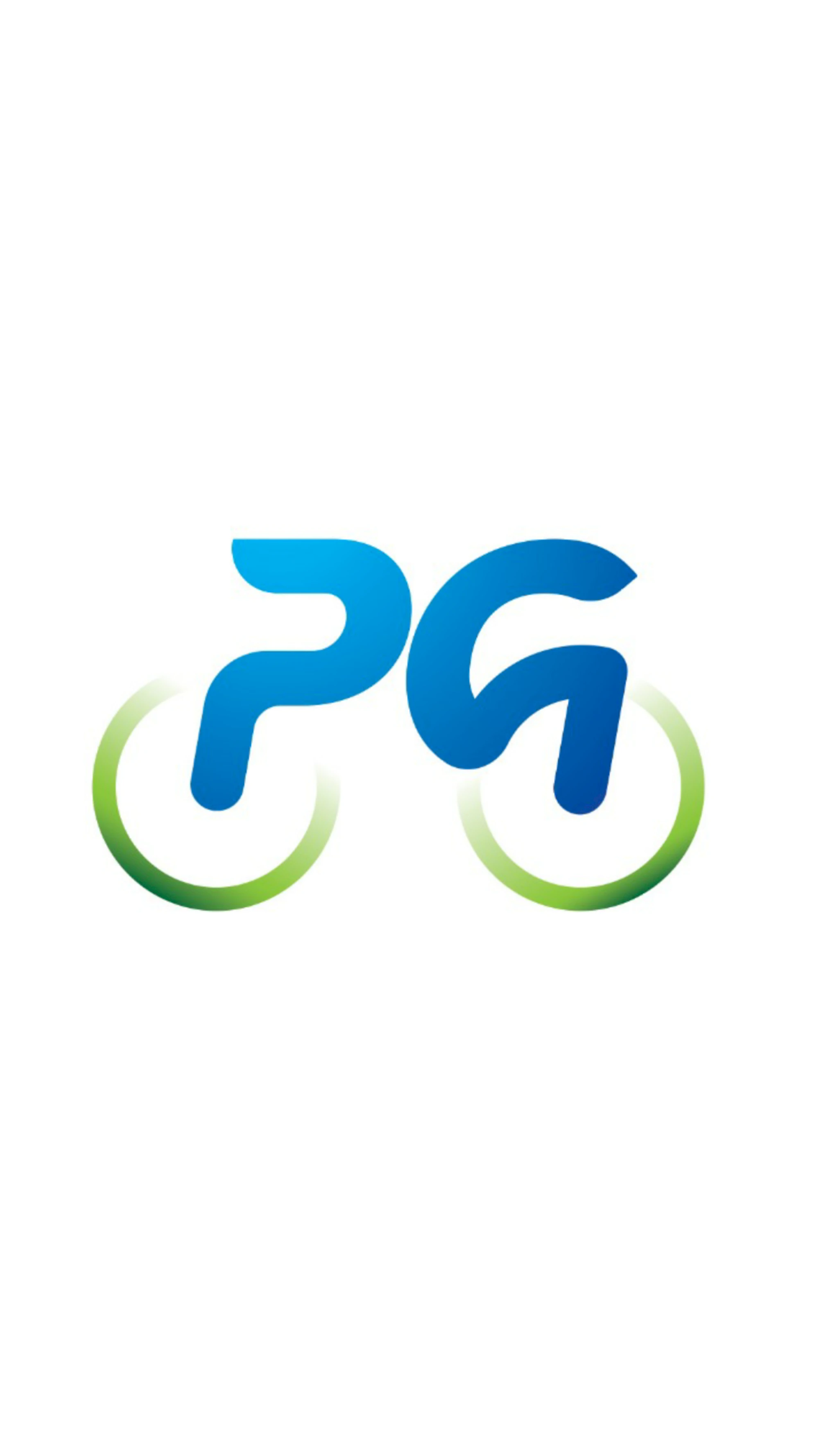
Identity for Podgorica na dva točka, the city initiative through which the Capital supports bicycle purchase subsidies and everyday urban cycling. Civic graphic design works best when it feels useful rather than ceremonial, so the system stays direct, friendly and easy to reproduce. The compact PG monogram references initials, wheels and movement at once, which makes the logo readable across public calls, stickers, forms and digital announcements.
What gives Podgorica na dva točka weight is not only the symbol or typography, but the way the message stays readable once it leaves the mockup and enters public space. The composition is built to hold attention quickly, keep hierarchy intact and support repeated use across banners, announcements, social communication and campaign rollouts.
For a civic initiative, that usability is part of the design quality. The identity has to circulate through forms, public calls, stickers and municipal communication without friction, and the reduced monogram makes that possible.
Gallery
All project images are served through ProcessWire image variations with WebP URLs when available.
More work
Related archive items from the same portfolio collection.