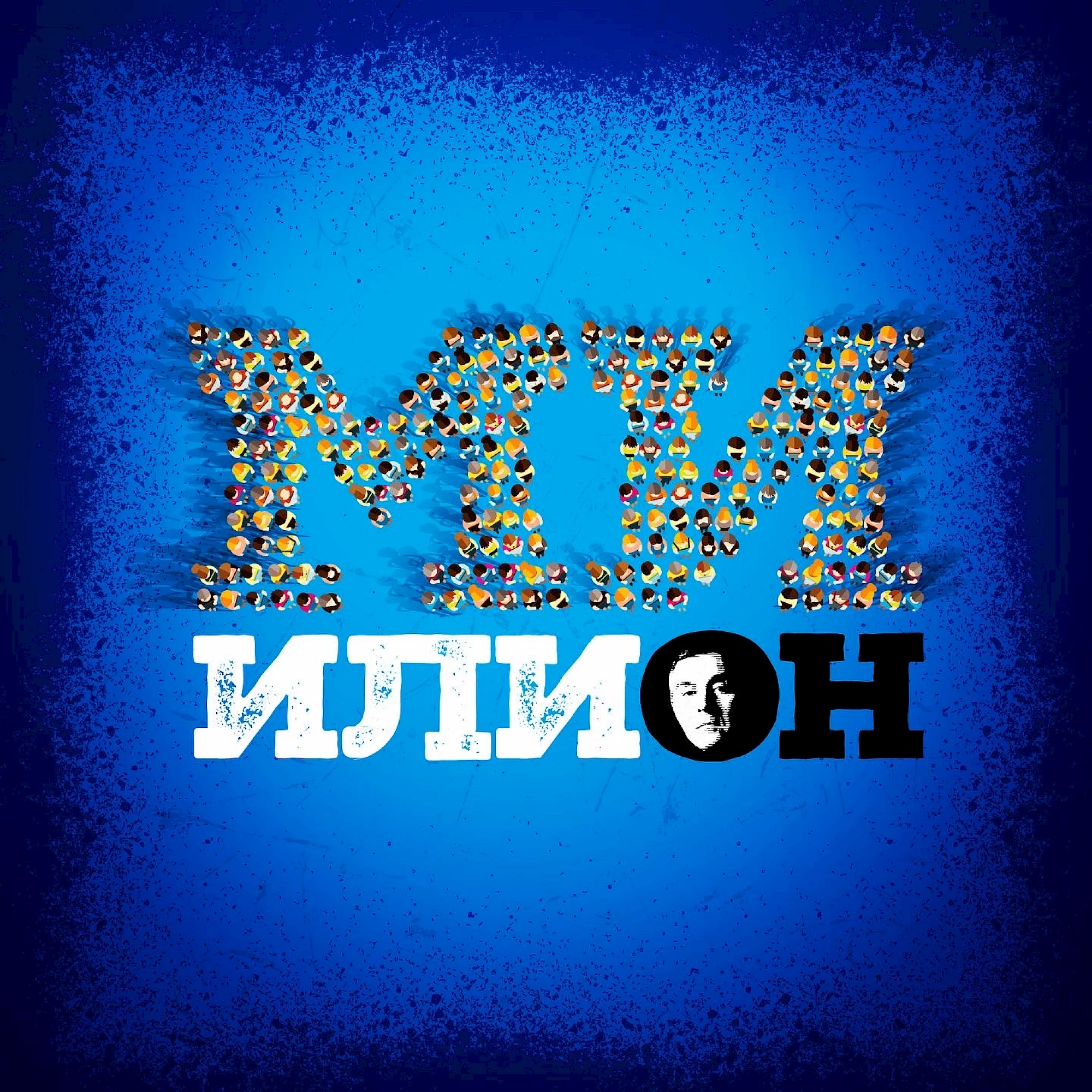
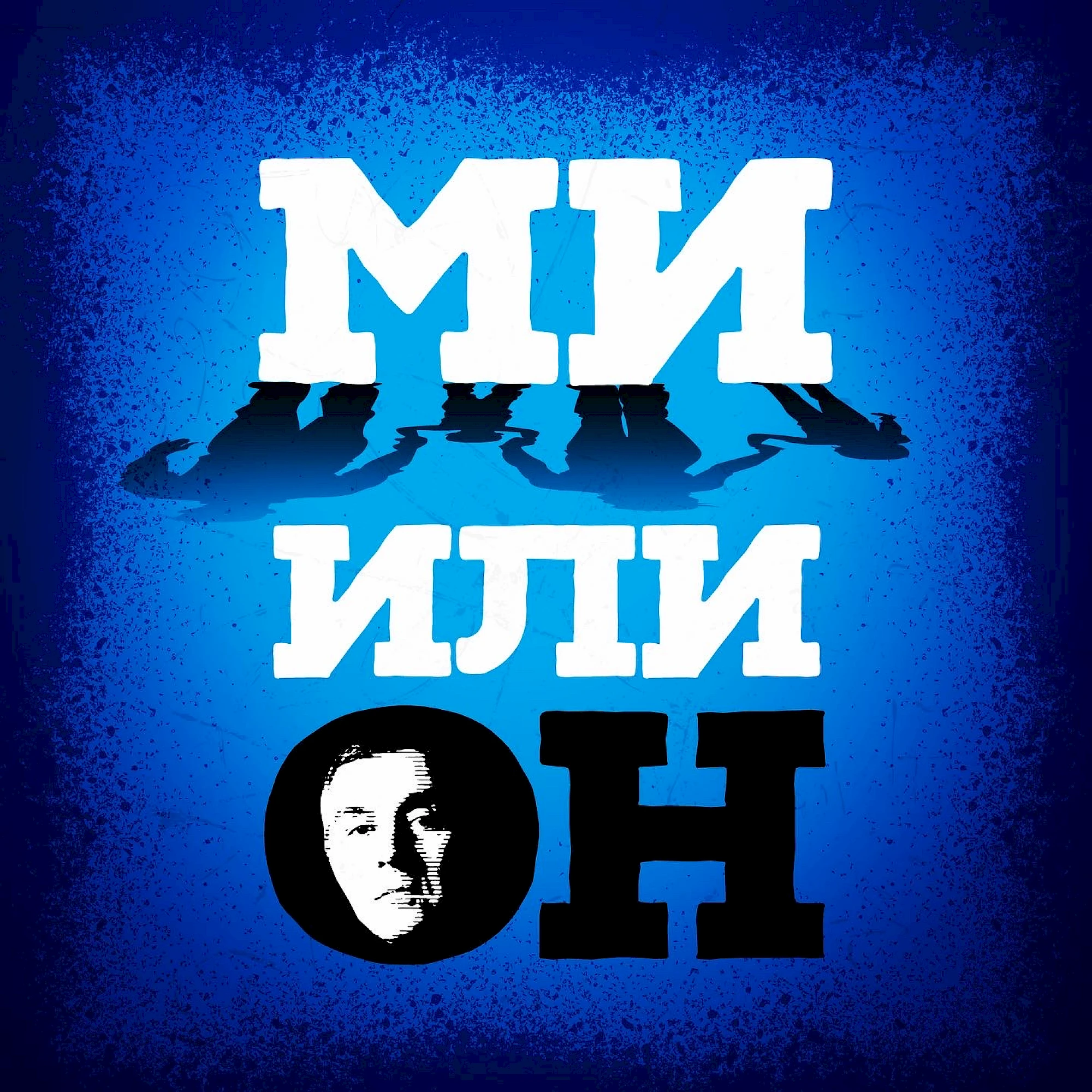
Mi ili On is constructed around confrontation. Split typography, strong contrast and a central portrait cue sharpen the sense of division already present in the title and turn the poster into a clear visual choice.
The poster language here relies on a clear emotional centre: image, title and contrast are aligned so the idea lands in one reading instead of several weaker ones. That economy is important for Mi ili On, because the work has to be memorable both from distance and in smaller promotional formats where only the strongest visual decision survives.
Gallery
All project images are served through ProcessWire image variations with WebP URLs when available.
More work
Related archive items from the same portfolio collection.