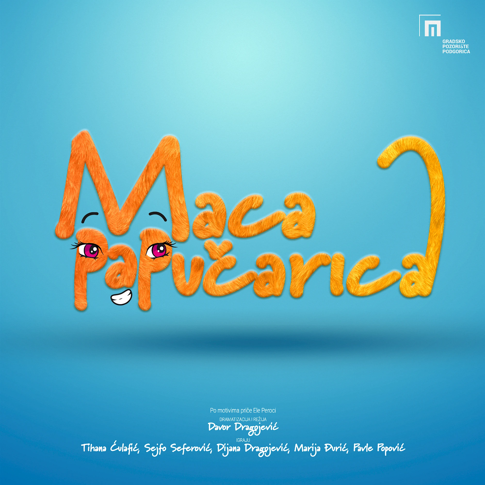
Maca Papučarica uses playful lettering and a bright, open palette to speak immediately to a younger audience. The title stays warm, recognisable and easy to reproduce across children's materials without losing charm.
For younger audiences, warmth and readability matter more than complexity, and Maca Papučarica stays on that side of the line. The forms feel friendly, the color logic stays open and the overall tone remains easy to reproduce across stage, print and educational material without losing character.
Gallery
All project images are served through ProcessWire image variations with WebP URLs when available.
More work
Related archive items from the same portfolio collection.