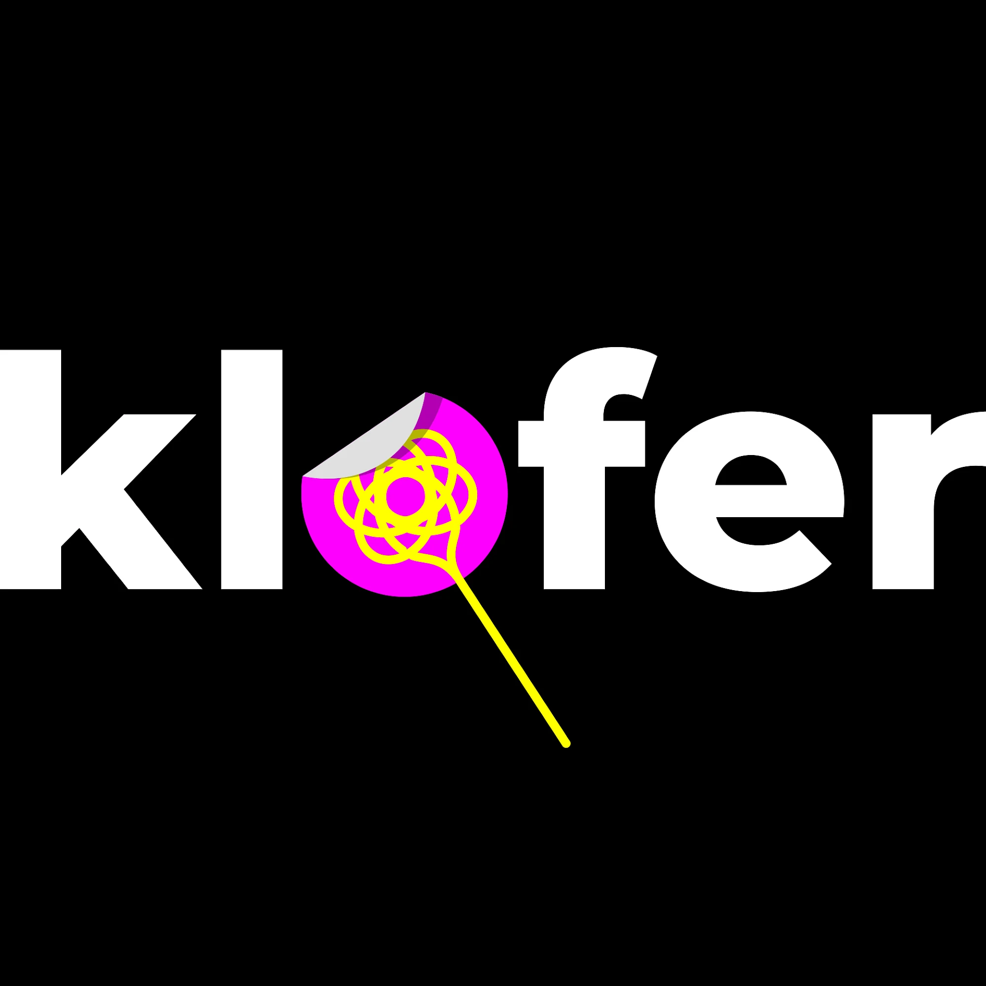
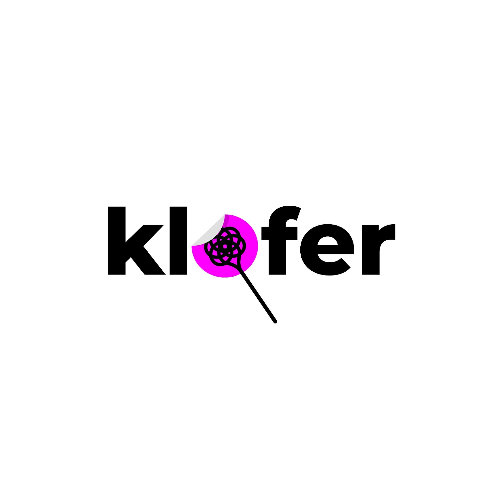
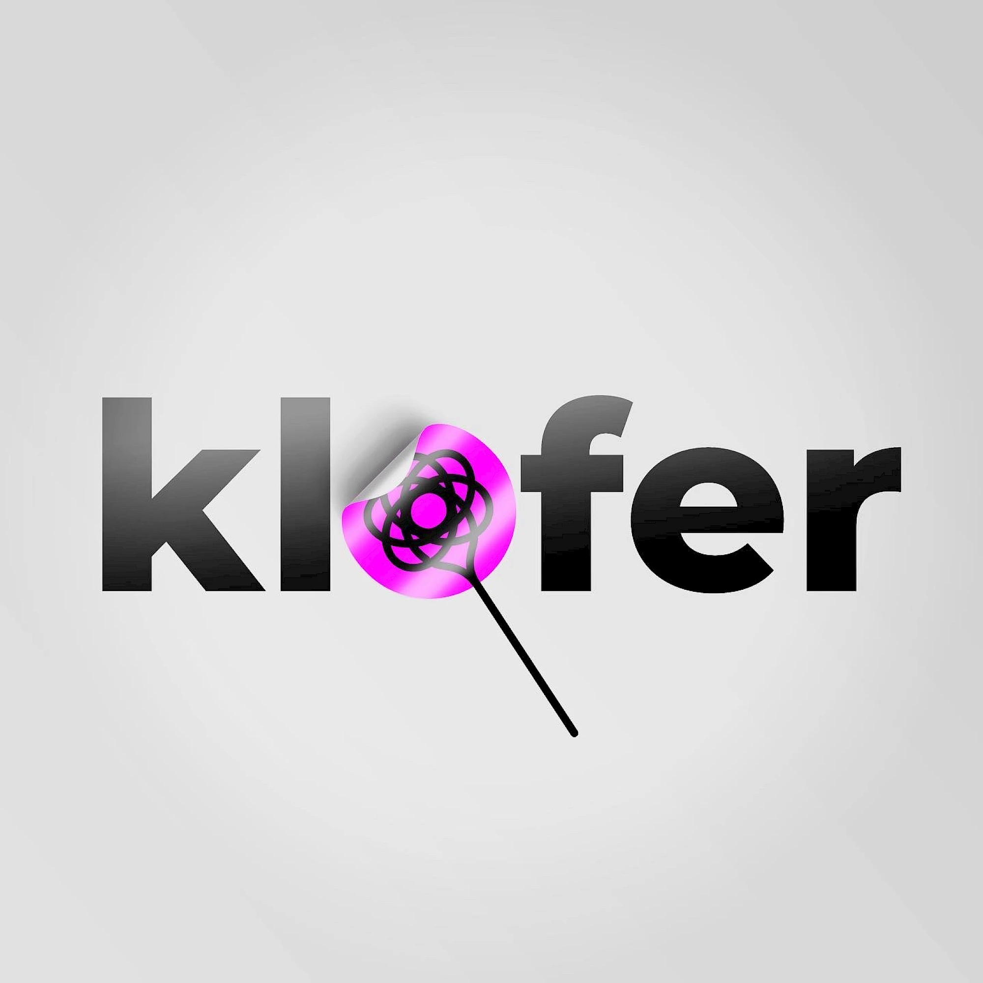
Klofer podkast needed an identity that could hold attention in small digital formats and still feel playful enough for a conversational media brand. Bold condensed type and the circular accent inside the wordmark make the logo readable, catchy and easy to extend across episode covers.
Audio brands often live inside very small square formats, so the identity for Klofer podkast is pushed toward strong silhouette, direct rhythm and immediate thumbnail recognition. That makes the system more useful in episode covers, streaming tiles, social snippets and other fast-moving media placements.
Gallery
All project images are served through ProcessWire image variations with WebP URLs when available.
More work
Related archive items from the same portfolio collection.